by Michael Canuel

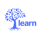
The LEARN logo. The start to the 2011-12 school year was heralded by a new logo for LEARN. The new look is fresh, simple, yet wonderfully expressive and meaningful. The tree of knowledge with ripe fruit ready to be enjoyed is at the center of our new look. The lowercase letters spelling out the word “learn” deliver more than a corporate image; this is a message to our community and to people everywhere that to learn is a lifelong endeavor in which we must all engage. The green and blue colors are archetypal reminders of our world and the boundaries and expanses around us.
Now with all that behind us, the new logo is simply cool. Young and hip. Nothing like me: I know but still I really like it, and so many have already given us such positive feedback. It is the choice of the Millennials in our organization, and I think they did a great job.
Of course the challenge for LEARN is to live up to its own hype, and I think this year we might just outdo ourselves. The student-focused resources that are coming onto the site are going to open the door to so many exciting and interesting projects; I simply cannot wait. Moreover, these resources, which tap into the interests of students in Quebec, also use social media tools, which are so prevalent in the 21st century. In addition, this year we are adding the research component to the work we are doing. As we undertake the development of these student resources, we will be providing the accompanying academic research which supports the direction we are taking. As a result, not only will our work be timely and responsive to the needs of our community, it will be grounded in sound findings in the field of education.
The 2011-12 school year continues to be a most exciting and challenging year, but we would never want it to be otherwise. It is what makes LEARN the exceptional organization it has become.

